My sister-in-law needs an artist. So one day whilst visiting her, she describes what she wants. A train. I'm sure that request sounded simple to her (and probably everyone else); A few wheels, a track, a round thingy in front and a smoke stack. Easy-peasy lemon-squeezy. Except that it isn't easy or peasy or even lemon-squeezy. It's all valves and piston push rods and railing and rivets and...ugh. Many do-dads to render. Many hours of work. Unfortunately, she imagined the cost would be a bit less than what I thought all that time was worth . So I struggled with doing a discount piece or simply telling her my price, knowing that it was higher than what she wanted to pay and leaving it at that. I was afraid she'd think I was ripping her off or something, so I went about demonstrating why the price was what I quoted it to be (I don't normally do this). I care about my sis and her opinion of me is important.
So I dig up some reference, do up a full pencil sketch. She heard my explanation about many hours worth of rendering for all the little details and proceeded to ask if I could delete the details. Some artists would agree to that and take the money. In my younger days I would have but I'm older now and I told her no. It was my name going on that piece of art and I don't skimp on quality. It's just not in anybody's best interest.
Money is spent and gone forever, but my art will remain. After I'm gone the artwork I do will still be around and I'll not have a shoddy piece representing me. As I said above, for most clients I simply state my price and let them decide, but I attempted to make my sister-in-law understand why I wouldn't produce a less-than-perfect picture. Since she's a teacher I put it to her this way, "What would you do if your principal asked you to grade only half the students' papers because grading all of them takes too long and the school didn't want to pay you for that?" She said that very same thing had actually happened and that some teachers did it and others, like her, refused (I applaud her for that!). I then pointed out that my art is like her job; some artists will skimp and some will not. I would not skimp just to save someone money. I think she took my point. Plus, to put a picture out there that's less than my standard of quality would decrease the worth of any other picture someone had bought from me.
So I may lose that job but it will be worth it. Anything a person does should be done to the highest quality possible and at the fairest price for that quality. It doesn't matter that there are artists better or worse than me out there and it doesn't matter what they charge. If a person wants your work, they deserve the best and sometimes the best isn't the cheapest.
Don't be afraid to lose money, be afraid to lose worth.

Tuesday, March 29, 2011
Friday, March 11, 2011
Strive to be wrong
If you look over at my 'Blogs you should be reading' section, you'll see an [e]. That's the blog of Eric Canete, a comic artist that isn't correct. He's wrong. Wonderfully wrong. Pleasingly wrong. All artists should wish we could be as wrong as he is. No, I'm not off my nut.....at least at the moment....
Too many artists spend too much time stressing over 'getting it right'. The proportions of the face must be 'right', the lighting on the tree must be 'right', etc to infinity. Well, you're all wrong, and it's not the good kind of wrong, either. Distill it down and art's only rule is that it should be pleasing. Sure, you have to know light, color, value, etc to make it look pleasing, but don't get hung up on all that overmuch. In the end, it has to look good and if you've fussed over the fundamentals too much, you can obscure the 'right' of a picture. Eric Canete stretches and distorts his figures and it all should look wrong, but it doesn't. It looks fantastically good. It looks 'right' even though it's almost totally wrong.
The two ways you can get your picture to look good are:
1) Composition. Study this. You need to know composition before you know anything else. Seek out books by Andrew Loomis, preferably 'Creative Illustration'. There's a wealth of composition information in there. All Loomis' books should be available at free online libraries or by searching for him and the term 'pdf' on Google.
2) Mood. Unfortunately, I don't think this can be easily taught. Subtle things like distorting a figure towards the camera to give it a sense of urgency or showing a character small on a large background to convey hopelessness come only when you stop thinking about it. You must detach your analytical self and let your emotions carry your pencil; you'll be surprised at how effective your emotions are at forming a picture!
Certainly there are other things an artist must know, like tone, value, form and light, but those are secondary. Those are the flesh and the clothes you put on your emotional, 'wrong' sketch. Don't be afraid to do what is wrong as long as it looks good.
One exercise is to do a small sketch, not worrying about getting the proportions down correctly. Go for the mood. When you've got that, transfer the sketch directly to your board and only then search out reference that roughly matches the pose and lighting of your sketch. Execute that to completion, letting your colors be dictated by your mood.
One final caveat. I'm no professional. Art should take you and do with you what it will. If my thoughts here run counter to your style or experiences please ignore them and follow your own muse. That's really what it's all about anyway.
Thursday, March 10, 2011
Going Back To the Well

I never took anatomy classes. I never drew from a nude model. I learned my anatomy at the tender age of seven by tracing over comic books. I was lucky, the comic books I had were drawn by artists that knew their anatomy dead-on. John Romita, John Buscema and Neil Adams. I highly recommend tracing as a tool for learning, but that's a subject for a different post. The key here is that I imprinted the lines and forms of the human figure very early, but even so I sometimes find that I run out of talent and forget how the forms work together.

Every now and again, when I just can't get the muscle structure right or I feel I need a refresher on some part of anatomy, I reach for this book and sketch from it.
I would recommend that everyone do the same. Further, I would suggest that you don't use pencil. Use a fine point, precise pen that lets you sketch freely. You want a pen that floats over the paper with as little resistance as possible. Pen makes it impossible to erase and will train you to lay a line down and forget it. It will develop a loose sketch style that will serve you well for years to come.
Here are some sketches I did to show you what I mean. A few were done in pen and a few in pencil.


Wednesday, March 9, 2011
The importance of Blogs
For an artist, blogs are very important. As an illustrator you need one because art directors use them more and more these days to check the activity of their artists. If you're posting regularly, you're active and you're putting yourself out there and you generally look busy. Lets face it, after you get a job from an art director, you disappear for a few weeks while you work. A blog is a way to let the art director know you're still alive. These same reasons apply to fine artists as well. Gallery owners like to see what you're up to. It gives them a personal connection to you without all the bother of calling you daily or setting up lunches.
So how do you use a blog? Do you just ramble on about what your dog did today or how the kids are doing in math class? Do you wax political and philosophical? What work do you show here, if any?
First off, remember that a blog is an extension of your business. You're in the business to sell your art. You will not sell your art if you talk about politics. You will inevitably tick-off some art director or gallery buyer with your views.
Do talk a bit about your personal life but avoid negative comments. You want to keep it positive. It's OK to share your struggles with a model getting the right pose, but always put a positive spin on it. Superficial? Maybe, but our life is filled with turning negative into positive and your blog posts should be no different. Why depress when you could inspire?
I'm of the opinion that the perfect way for an artist to use a blog is to post personal art here. If you're allowed to by your client, you can even post process shots and works in progress pics here too. You should have a website for your portfolio and a blog for your personal artwork with a bit of personal posts to give it flavor.
So, as an artist just moving from private commissions to one working for clients, I'm following my own advice. This blog is now active and my portfolio is in progress. I'll share it all as I go.
Friday, March 4, 2011
Digital Identity
Oils look like oils. Watercolors like watercolors. Ducks are ducks and armadillos are...well...strange. At any rate, things should look like what they are. So what are digital paintings? This is the question I've been struggling with lately.
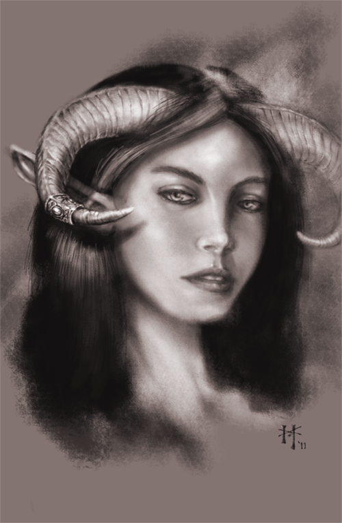
Before I go further, here's a piece I did in Photoshop to become familiar with digital drawing:
 I instinctively went for a charcoal look. I did this test piece in the same manner that I would do a tonal study of a subject before I painted it. This begs the question: Why didn't I just use paper and some charcoal? It would certainly have looked better. I've seen other digital pieces where the artist has emulated everything from oils to colored pencil. Digital art is a changeling that we're never quite sure of it's original form.
I quickly came to the conclusion, after doing my digital charcoal study, that trying to emulate a physical painting medium is just a waste of time and electricity. If you want an oil painting, go paint in oil. So then what's the use of digital painting? Surely not to save us from breathing in Turpenoid or cleaning brushes (both activities are highly enjoyable for me, btw). Digital painting has it's own 'look' as distict from oils as watercolor is from pastel. Digital paint is bright and slick. It's textures overlapping shapes. It's beautiful chaos made from mathematicaly precise brushes and stock textures. It's a highly-stylized view of life, painted with light.
The real identity of digital art isn't to emulate a physical medium. Some may argue the point, but let them rant. The most basic rule of art is 'know your medium; know your tools'. You want oils? Break out the linseed and canvas. You want watercolor? Go soak your paper and prepare for many washes of color. You want slick, bright, high-tech, textures and lines assaulting your grill? Pick up the Wacom, my friend and jump into the matrix. Now, after I've spent a thousand words on this, here's a picture. Or two. Alright, here are two websites that will show you what digital art is.
http://androidjones.net/
http://artizako.cgsociety.org/gallery/
Subscribe to:
Posts (Atom)